Compare the usability of the Desktop vs. Mobile Interface
What are the obstacles on each interface and do any overlap?
Which interface is easier to use?
Compare perspective of usability for designers vs. non-designers
Does having design experience make Canva easier to use?
Do more experienced designers feel limited by Canva’s interface?
Determine the ease of use for posting to Facebook
How does the sharing process compare on a mobile device vs. desktop?
What are the obstacles faced on each interface during the posting process?
Method
Canva strives to provide the user with a simple way to make high quality graphics and designs for a variety of platforms. In order to test this, my classmates and I used qualitative and quantitative data collected from six volunteers that ranged in age, experience with the interface, and experience in graphic design.
First, each user completed a pre-test questionnaire to determine specific demographics and experience with graphic design software.
Then, the users were given two scenarios to create a Facebook post for separate holiday parties. One was to be made using a mobile phone, and the other was created using a laptop.
Each user was given the same device and scenario breakdown. Half of the users designed on the mobile interface first, followed by the desktop interface. A screen recording software was used to track their actions and analyzed later to provide insight.
Finally, each user filled out a Post-Test Questionnaire that recorded qualitative data regarding their experiences with both interfaces.
Analysis
When the testing was completed, the recordings were examined to determine the length of the design process, the method of designing (did the user work from a template or from scratch), and how many problems the user encounter when designing and uploading to Facebook.
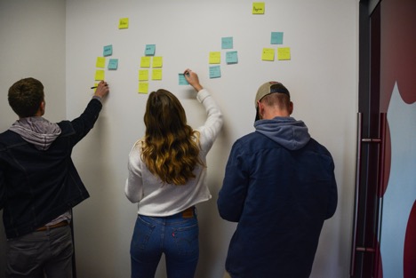
After the data was collected, my classmates and I completed affinity diagrams to organize and synthesize our findings. We found that affinity diagrams were a great way to quickly organize and sort through large amounts of data. The use of sticky notes made it easy for us to collaborate and visualize the outcomes from our testing scenarios.
Findings
In summary, the results of our usability test show that:
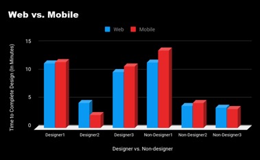
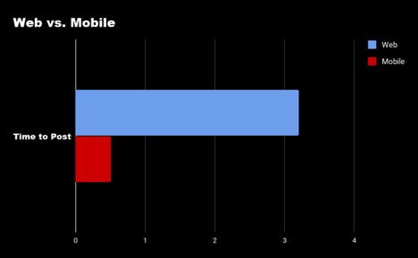
The average time to post to Facebook was 3 minutes and 12 seconds on desktop and 31 seconds on mobile
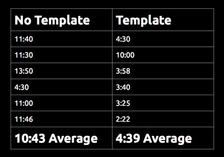
The average time to create a design using a template was 4 minutes and 39 seconds, and the average time to design without using a template was 10 minutes and 43 seconds.
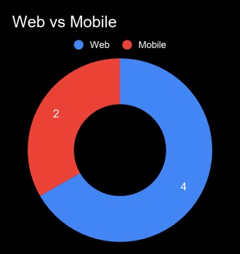
Users preferred to upload a design using the mobile interface.
Two-thirds of the users preferred designing on the web interface.
Recommendations
Optimize the search results page:
Canva’s home page presents the user with templates that are categorized based on the dimensions necessary for a particular use (i.e for Instagram Post, Facebook Cover Photo, etc.). When a user searches for templates, the dimensions and platforms for the suggested templates are not clear. As a result, a test participant unknowingly posted a YouTube Thumbnail design on Facebook, which was far too small for a Facebook user to read. Canva should organize their search results page in a way that notifies the user which platform they are designing for.
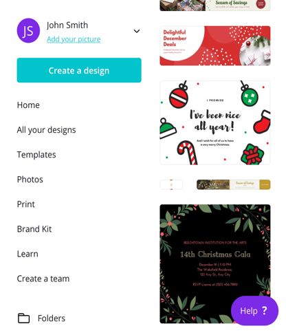
Searched Template Designs on Mobile Screen
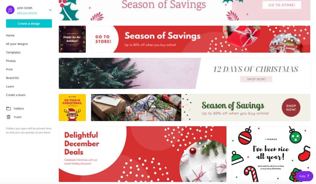
Searched Template Designs on Desktop Screen
Editing Text on Mobile Interface:
Many participants struggled with editing text found in Canva’s templates on mobile devices. This is perhaps due to the fact that users were using their previous experience with mobile texting to edit specific words and letters. Like many texting features in mobile phone applications, users would try to hold down a finger to accurately navigate their cursor through the text, however using this technique in Canva’s application results in highlighting the entirety of the text. If Canva adopts this common practice, users may be able to edit their designs smoothly and intuitively.